
Redesigning a Digital
5S Tool
I redesigned Boards on Fire’s digital 5S tool to make Lean principles more practical, engaging, and accessible for organizations.
The Goal:
-
Bridge the gap between Lean 5S theory and practical application in the digital tool
-
Establish a clearer and more intuitive structure and information hierarchy for improved navigation and progress tracking
-
Build a modular design system that supports both beginners and advanced users with flexibility
-
Streamline workflows to reduce manual effort, prevent errors, and enhance user efficiency

My Role
"A Digital Tool
to Help Organizations "
As UX Lead I led user interviews, created wireframes and prototypes, and conducted usability testing with editors to iterate towards the optimal solution. I collaborated closely with product stakeholders throughout the process.
Role
UX lead for reserach, design & prototyping,
collaborated closely with stakeholders
Collaboration
Product managers and UX team
Tools
Figma, Carbon Design System, Miro & User Testing
Period
Jan - Jun, 2025
The Problem
Boards on Fire users struggled to apply Lean 5S principles in their daily work due to a tool that was difficult to use and failed to meet user needs.
Key problems:
-
Fragmented and unclear documentation across platforms
-
No tailored support for different user roles
-
Time-consuming manual processes with no automation
-
Poor error handling and lack of user support
-
Overloaded interface with limited visual clarity
Research & Design Process
-
Interviews and observations with 8 users across 4 large companies in Sweden
-
Performed a heuristic evaluation of the existing tool to identify usability issues.
-
Carried out market and competitor analysis to benchmark best practices and opportunities.
1
Discovery
Data analysis showed
Data analysis revealed that the existing 5S tool was rigid, overly theoretical, and lacked sufficient guidance, with additional usability issues including poor navigation, unclear progress indicators, inefficient workflows, lack of automation, limited user support, and a cluttered interface that hindered efficiency.
Key Findings:
-
Beginners needed step-by-step guidance and structured onboarding.
-
Advanced users wanted more flexibility and customization options.
-
Managers required transparent progress tracking and visual dashboards.
-
Editors struggled with inefficient, manual workflows that slowed down content updates.
As a result, these issues prevented users from working effectively, staying engaged, and fully realizing the tool’s potential.
Requirements → Design Solutions → Impact
Requirement
Guided onboarding
Pre-designed layouts & modules
Customization & flexibility
Efficient workflows
Instant feedback
Real-time progress tracking
Consistent terminology & scoring
Clean, visual interface
Design Solution
Added a step-by-step wizard
Provided ready-to-use templates with drag-and-drop functionality
Allowed custom questions, criteria, and dashboard layouts
Enabled drag-and-drop modules and consecutive deviation entries
Inline validation and contextual error messages
Designed dashboards with visual reports
Standardized labels, scoring logic, and iconography
Applied modular design, icons, and color hierarchy
Impact
Reduced learning curve, smoother adoption
Helped beginners start quickly without confusion
Adapted to advanced users’ diverse needs
Streamlined processes, saved time
Fewer mistakes, more confidence in use
Improved transparency and motivation
Ensured clarity across teams and reduced confusion
Improved navigation, reduced cognitive load
2
Visual Identity
Respect Carbon Design System
We aimed to innovate with new concepts and animations while adhering to Boards on Fire’s guidelines to ensure we stayed within their design system rules. Since their design was most closely aligned with the Carbon Design System, we chose to work with it.


Scenario
Onboarding a New 5S Leader
Johan, a 5S leader and administrator at his company, logs into Boards on Fire’s 5S tool for the first time after purchase.
He is welcomed with an introduction screen and a clear call-to-action: “Start building your 5S tool.” With one click, Johan enters editing mode, where he chooses a layout as the foundation for his dashboard. A side panel appears with ready-made modules such as:
-
Checklist – follow up on work tasks
-
Deviation Management – report and track issues
-
Metrics – monitor key indicators
-
Score Tracker – visualize results
-
Bar Chart – track trends
-
Lists – structure information
The modules can be easily dragged and dropped into the layout. The side panel can be viewed either as a checklist or with images, depending on the user’s preference.
As Johan builds his dashboard, the system guides him step by step, applying the Progressive Disclosure principle, only showing what’s relevant in each step. This reduces cognitive load and creates a smooth onboarding flow.
Once the setup is complete, Johan clicks “Save” and immediately receives visual confirmation that his personalized 5S dashboard is ready. He now has a clear, customized workspace to support continuous improvement at his company.

Scenario
Creating a Deviation (Production)
Lina, who works in the production department, needs to register a 5S deviation related to cleaning. From the homepage, she clicks the “Add Deviation” button, which is always accessible at the top of every page.
A modal form opens, where Lina enters the necessary details:
-
Type & description (free text)
-
Start and end date
-
Area / department / organization
-
Relevant “S” (e.g., Sort)
-
Priority (color-coded or numeric scale)
-
Image upload (attach a photo)
-
Assignment (select responsible person from drop-down)
When Lina clicks “Save”, the system provides inline validation, highlighting missing required fields. After completing the missing details, she receives a visual confirmation that the deviation has been successfully registered.
On the overview page, Lina can now see her deviation logged with key details: timeline, status, and assigned responsibility.

3
Ideate
Let´s Create
I started with sketches and wireframes to visualize an improved navigation structure. Prototypes were created and iteratively tested with the owner to ensure the solution met their needs and was intuitive to use.
Digital Sketches
This section highlights the initial sketches created in alignment with the defined scenarios and requirements. Using Figma, I explored and tested a variety of low-fidelity wireframes to investigate different layout structures and navigation flows.


Wireframes
After several collaborative workshops, we narrowed down our initial low-fidelity concepts to a set of promising directions.
Using Figma, I created low-fidelity wireframes to explore different structural approaches, with a strong focus on modular design elements. This ensured that editors could create and update pages quickly while maintaining visual consistency.
To validate key assumptions, I conducted early prototype testing with the product owner. This provided valuable feedback, helping us refine the information architecture and confirm that the modular approach aligned with real editorial workflows before moving into high-fidelity design.
 |  |  |  |
|---|---|---|---|
 |  |  |
Final Design
Onboardning
First-Time Setup of the 5S Tool
-
Welcome & Start - A welcome screen introduces the tool with a clear CTA: “Start building your 5S tool.”
-
Goal Definition - Johan defines his goals and how to achieve them.
-
Layout Selection - He selects a dashboard layout as the foundation.
-
Add Modules - From a side panel, he drags and drops modules such as Checklists, Deviation Management, Metrics, and Charts.
-
Guided Steps - The system applies progressive disclosure, guiding him step by step while only showing what’s relevant.
-
Save & Confirmation - Johan saves his dashboard, receives instant visual feedback, and lands on his fully customized workspace.
1. Welcome & Start
2. Goal Definition
3. Layout Selection


.png)
4. Add Modules
5. Guided Steps
6. The Dashboard
The solution
Creating a Deviation
Start Action - Lina logs in and clicks the always-accessible “Add Deviation” button at the top of the home page.
Form Entry - A modal opens where she fills in:
-
Type & description
-
Start and end date
-
Area / department
-
Relevant 5S category (e.g., Sort)
-
Priority (color-coded or numeric)
-
Image upload
-
Assigned colleague or manager
Validation & Feedback - When she clicks “Save”, the system highlights a missing required field. After correcting it, she saves again and receives a clear confirmation that the deviation has been registered.
Overview - On the dashboard, Lina now sees her deviation logged with status, due date, and assigned responsibility.
1. Dashboard
2. Overview of Deviation (list)


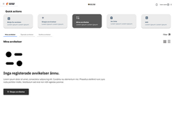
3. Overview of Deviation (Empty State)
4. Modal Form for Creating Deviation


Final Outcome
The resulting design transforms Lean 5S from abstract theory into a concrete, actionable workflow. It empowers teams to set goals, track progress, and sustain improvements over time.
The redesigned tool delivered measurable improvements:
-
Faster onboarding and clearer user guidance
-
Streamlined workflows reduced manual tasks and errors
-
Improved engagement through visual dashboards and modular design
-
Increased flexibility for both new and experienced users
4
Reflection & Next Steps
Balancing User Freedom
Next Steps
This project taught me the importance of balancing user freedom with structured guidance. By providing both open-ended customization and ready-made examples, I was able to design a tool that meets diverse needs across industries.
If I had more time, I would:
-
Conduct broader usability testing with industry-specific teams
-
Automate recurring tasks to further improve efficiency
-
Add analytics to measure adoption and success
-
Perform a full accessibility audit (WCAG compliance)

Let's Create Something Amazing
I'm always open to discussing new opportunities, creative projects, or potential collaborations.